
Pluto Pay
UX Case Study
Overview
Introducing Pluto Pay. An innovative responsive web application that is designed to revitalize the conventional way of traditional banking. Pluto Pay revolutionizes the financial experience by offering a unified platform that not only seamlessly combines the functionalities of a secure bank account but incorporates a transactional card for generating payments and money transfers. Pluto Pay is an innovative method of banking that is tailored to meet the needs and wants of users that strongly desires a comprehensive and secure financial hub
Problem
In the evolving digital age, it can be determined that there is a chronic demand that exists within the financial industry. A demand that addresses the frustration of users that lack the ability to create transactions, make payments, and have a bank account that exhibits security. It can be determined that users are seeking a responsive web app in which provides consumers an array of features in which permits users with the ability to generate money transfers and payments while having access to a secure bank account. Additionally, users are requesting a unified platform that offers the convenience of traditional banking services along with the agility of transactional card features
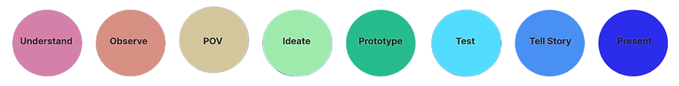
Design Process
Competitive Analysis
A competitive analysis was conducted after compiling an in-depth research on competing financial companies that provided advanced financial applications that offered innovative features to consumers within its target market. The overall main focus was to analyze the opportunities, market advantage, strategy, profile, and key objectives of the competitors. In order to gain accurate data, a SWOT analysis was conducted

CashApp

PayPal
CashApp
Strengths:
-
Simplified peer to peer transaction provided on a user friendly platform for Android and iOS
-
Via integration with service offered by Square provides users to access to a broader ecosystem
Weaknesses:
-
Limited international functionality compared to rivals
-
Limited business for business accounts compared to established payment services

-
Slow response time and an array of user report issues related to account stability
Opportunities:
-
Partnerships with retail businesses to offer cashback and discounts when using Cash App
Threats:
-
Increased competition from rivals such as Google Play, PayPal, PlutoPay, Venmo, Zelle, etc
PayPal
Strengths:
-
User base with over 400 million active accounts coupled with global brand recognition and trust
-
Strong mobile presence with popular apps for Android and iOS

Weaknesses:
-
Complaints that user interface is less intuitive compared to other platforms
-
Constant freezing of the accounts without notice hinders user trust

-
Prone to cyber attacks and fraud hence hindering security and user trust
Opportunities:
-
Integration with social media platforms to generate peer-to-peer payments and commerce
Threats:
-
Vulnerability to cyber attacks and data breaches hence undermining the trust of users
User Research
A competitive analysis was conducted after compiling an in-depth research on competing financial companies that provided advanced financial applications that offered innovative features to consumers within its target market. The overall main focus was to analyze the opportunities, market advantage, strategy, profile, and key objectives of the competitors.
Participants
Jamaal Ejigou
Age: 37
Location: Miami, FL
Occupation: Portfolio Manager
Jawaar Ekeche
Age: 40
Location: Los Angeles, CA
Occupation: Financial Analyst
Tamika Patton
Age: 38
Location: Philadelphia, PA
Occupation: Software Engineer
Affinity Mapping
In order to distinguish the user needs and preferences after compiling data from the user research, I established affinity mapping

User Persona
Based on the collected data that was gathered from user interviews, I developed a user persona in which displayed the needs, wants, frustrations, and pain points of users. I was able to craft a total of two personas to assist in designing on behalf of the users
![Jamaal.Ejigou.[Persona].png](https://static.wixstatic.com/media/ccd845_fe93018c8cf34f36a66c7669be52a4aa~mv2.png/v1/crop/x_8,y_0,w_1916,h_695/fill/w_980,h_355,al_c,q_85,usm_0.66_1.00_0.01,enc_avif,quality_auto/Jamaal_Ejigou_%5BPersona%5D.png)
![Jawaar.Ekeche.[Persona].png](https://static.wixstatic.com/media/ccd845_30032db8cdd84f949e0c050554000413~mv2.png/v1/crop/x_9,y_0,w_1916,h_709/fill/w_976,h_361,al_c,q_85,usm_0.66_1.00_0.01,enc_avif,quality_auto/Jawaar_Ekeche_%5BPersona%5D.png)
![Tamika.Patton.[Persona].png](https://static.wixstatic.com/media/ccd845_6a5fb978211f4d49aa8f61aa83c23b8f~mv2.png/v1/crop/x_0,y_63,w_1918,h_688/fill/w_979,h_351,al_c,q_85,usm_0.66_1.00_0.01,enc_avif,quality_auto/Tamika_Patton_%5BPersona%5D.png)
User Journey Map
A user journey map was generated in order to empathize with the user persona of Jawaar and Tamika
![Jawaar Ekeche.[User.Journey.Map].png](https://static.wixstatic.com/media/ccd845_c3f5f66ee218422889cfb5ca11ebc94b~mv2.png/v1/fill/w_980,h_567,al_c,q_90,usm_0.66_1.00_0.01,enc_avif,quality_auto/JE_%5BUser_Journey_Map%5D_%5Ba%5D.png)
![TP.[User.Journey.Map].[a].png](https://static.wixstatic.com/media/ccd845_aeccba0de0d04b158c0be6cacc66ba8e~mv2.png/v1/fill/w_980,h_567,al_c,q_90,usm_0.66_1.00_0.01,enc_avif,quality_auto/TP_%5BUser_Journey_Map%5D_%5Ba%5D.png)
User Flow
In order to comprehend the user's point of view, I generated a user flow to contemplate various paths and decisions that the users will have to take in order to complete a specific task. In order to determine what screens will be needed to assist the user in successfully completing a task, I generated a user flow
![Jawaar.Ekeche.[UserFlow].png](https://static.wixstatic.com/media/ccd845_28ff17fb8b3c41cba7e7d5c86fa085fb~mv2.png/v1/crop/x_3315,y_79,w_10858,h_1791/fill/w_963,h_159,al_c,q_85,usm_0.66_1.00_0.01,enc_avif,quality_auto/Jawaar_Ekeche.png)
![Tamika.Patton.[UserFlow].png](https://static.wixstatic.com/media/ccd845_94ef4e5629ab496880cf62959d7d9aa3~mv2.png/v1/crop/x_3310,y_34,w_10863,h_1835/fill/w_953,h_161,al_c,q_85,usm_0.66_1.00_0.01,enc_avif,quality_auto/Tamika_Patton.png)
Card Sorting
Card sorting provided the ability to identify and distinguish how potential users previewed various features and pages on the responsive web app. An open card sort technique was utilized in which consisted of a total of 5 participants via the use of the productivity tool, Optimal Workshop. The open card sort technique that was conducted presented an array of useful data which provided detailed information of the needs, wants, and expectations of the users. In addition, the open card sorting exercise granted the opportunity to assess techniques that were used hence introducing better opportunities for card sorting tactics in the near future

![Card.Sorting.[p2].png](https://static.wixstatic.com/media/ccd845_27b88df83556463bb629fbb1c4d12c60~mv2.jpg/v1/fill/w_793,h_657,al_c,q_85,usm_0.66_1.00_0.01,enc_avif,quality_auto/Card_edited.jpg)
Information Architecture
Based on collected data gathered from user research, interviews, as well as the user persona, I was able to develop a sitemap that will exemplify the overall navigation of the app. In order to determine how the app will operate as well as the overall structure, developing the navigation sitemap will provide an array of benefits
![SiteMap.[Revised].png](https://static.wixstatic.com/media/ccd845_90e332816b214a73ab601539e2be258c~mv2.png/v1/fill/w_980,h_611,al_c,q_90,usm_0.66_1.00_0.01,enc_avif,quality_auto/ccd845_90e332816b214a73ab601539e2be258c~mv2.png)
Wireframes
After recognizing how the app will navigate, I began sketching wireframes so that the process will reveal the pages and screens associated to resolving specific tasks
Sketches
Task #1: Request Funds
![Homepage.[Sketch].png](https://static.wixstatic.com/media/ccd845_b48521e24fff4aa5897e9b7a8be13c5e~mv2.png/v1/fill/w_122,h_247,al_c,q_85,usm_0.66_1.00_0.01,enc_avif,quality_auto/ccd845_b48521e24fff4aa5897e9b7a8be13c5e~mv2.png)
Homepage
![Enter Data.[Sketch].png](https://static.wixstatic.com/media/ccd845_7d2ce96e2d954e6cb8104478ca70c49d~mv2.png/v1/fill/w_122,h_247,al_c,q_85,usm_0.66_1.00_0.01,enc_avif,quality_auto/ccd845_7d2ce96e2d954e6cb8104478ca70c49d~mv2.png)
Input Data
![Request Sent.[Sketch].png](https://static.wixstatic.com/media/ccd845_050a3bf22e8c4a6c8f59cb887a59ba8e~mv2.png/v1/fill/w_115,h_233,al_c,q_85,usm_0.66_1.00_0.01,enc_avif,quality_auto/ccd845_050a3bf22e8c4a6c8f59cb887a59ba8e~mv2.png)
Request Sent
![E-Receipt.[Sketch].png](https://static.wixstatic.com/media/ccd845_2468cefebc724214bde8fca888a89a4b~mv2.png/v1/fill/w_122,h_247,al_c,q_85,usm_0.66_1.00_0.01,enc_avif,quality_auto/ccd845_2468cefebc724214bde8fca888a89a4b~mv2.png)
E-Receipt
Mid-Fidelity Wireframes
Upon the completion of the low-fidelity wireframes, I began generating a clickable mid-fidelity and high-fidelity prototype. In addition, I implemented UI elements to each screen for the purpose of obtaining user feedback on the user flows via usability testing
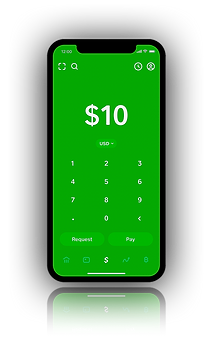
Task #1: Request Money
![Dashboard.[Low.Fidelity].png](https://static.wixstatic.com/media/ccd845_dc5bf88ff5d84cb18aa9fa5e791439ab~mv2.png/v1/fill/w_102,h_221,al_c,q_85,usm_0.66_1.00_0.01,enc_avif,quality_auto/iPhone%2013%20mini%20-%2033.png)
![Request.Money.[Low.Fidelity].png](https://static.wixstatic.com/media/ccd845_0dd9ca1ddbbb40358e97795c46ed2ab3~mv2.png/v1/fill/w_102,h_221,al_c,q_85,usm_0.66_1.00_0.01,enc_avif,quality_auto/iPhone%2013%20mini%20-%2032.png)
![Contact.List.[Low.Fidelity].png](https://static.wixstatic.com/media/ccd845_76be440ac10d46238b22ff358453813b~mv2.png/v1/fill/w_102,h_221,al_c,q_85,usm_0.66_1.00_0.01,enc_avif,quality_auto/ccd845_76be440ac10d46238b22ff358453813b~mv2.png)
![Enter.Data.[Low.Fidelity].png](https://static.wixstatic.com/media/ccd845_b9ab4e43f62c4ae58365b2d0801e8041~mv2.png/v1/fill/w_102,h_221,al_c,q_85,usm_0.66_1.00_0.01,enc_avif,quality_auto/iPhone%2013%20mini%20-%204.png)
![Request.Sent.[Low.Fidelity].png](https://static.wixstatic.com/media/ccd845_aedce3d28f2447c19cbf63ae4dd6a1b3~mv2.png/v1/fill/w_102,h_221,al_c,q_85,usm_0.66_1.00_0.01,enc_avif,quality_auto/iPhone%2013%20mini%20-%2042.png)
![E-Receipt.[Low.Fidelity].png](https://static.wixstatic.com/media/ccd845_1f477ee55dff42d59ac2dee408ee4eb2~mv2.png/v1/fill/w_102,h_221,al_c,q_85,usm_0.66_1.00_0.01,enc_avif,quality_auto/iPhone%2013%20mini%20-%2043.png)
Feel free to preview the entire mid-fidelity prototype
Usability Script And Test Plan
After creating the mid-fidelity prototype, I started the usability testing for the purpose of testing my prototype. In order to identify and distinguish how users will respond when operating the app, I conducted a usability test for the purpose of defining the specific goals and objectives that I aimed to achieve.
Into the equation, after developing a plan of what I aimed to accomplish and how I was going to specifically calculate the results, a usability script was created for the purpose of recruiting participants to engage in remote usability tests
Feel free to preview the usability test plan
Feel free to preview the usability test script


Affinity Map
After conducting the usability tests, the participants were able to detect specific usability issues that required minor revision and made recommendations in which allowed me to make the necessary improvements to enhance the overall user experience
An affinity map was implemented into the process after calculating the results from the usability tests. This included categorizing each participant under a specific color based off observation, positive quotes, negative quotes, as well as errors.
Upon completion of each participant, I generated a rainbow spreadsheet in which assisted me in organizing the data that was compiled from the usability test hence developing a clear visual pattern of the specific areas that needed to be addressed and modified


Implement Revisions
Though participants were able to complete the tasks, there were modifications that needed to be implemented in order to enhance the overall user experience

Mid-To-High Fidelity
Based from the reviews and feedback that was obtained from participants, revisions were made to the usability tests. Into the equation, additional visual elements were implemented into the process prior to generating a preference tests
Task #1: Request Money
[Mid-Fidelity]
Task #1: Request Money
[High-Fidelity]
![Dashboard.[High.Fidelity].png](https://static.wixstatic.com/media/ccd845_cac84696c3504ad5956a3fb22bd03cb2~mv2.png/v1/crop/x_117,y_0,w_965,h_1867/fill/w_174,h_336,al_c,q_85,usm_0.66_1.00_0.01,enc_avif,quality_auto/ccd845_cac84696c3504ad5956a3fb22bd03cb2~mv2.png)
![Request.Money.[High.Fidelity].png](https://static.wixstatic.com/media/ccd845_4f416256106b4cd2b8157c676a9125ba~mv2.png/v1/fill/w_187,h_285,al_c,q_85,usm_0.66_1.00_0.01,enc_avif,quality_auto/ccd845_4f416256106b4cd2b8157c676a9125ba~mv2.png)
![Contact.List.[High.Fidelity].png](https://static.wixstatic.com/media/ccd845_98cd80b6116c46a4aa647f5dda1d9697~mv2.png/v1/crop/x_50,y_33,w_973,h_1793/fill/w_176,h_324,al_c,q_85,usm_0.66_1.00_0.01,enc_avif,quality_auto/ccd845_98cd80b6116c46a4aa647f5dda1d9697~mv2.png)
![Contact.List.[p2].[High.Fidelity].png](https://static.wixstatic.com/media/ccd845_ba8b774884134112ae751f39856a8cbc~mv2.png/v1/crop/x_125,y_36,w_886,h_1612/fill/w_175,h_318,al_c,q_85,usm_0.66_1.00_0.01,enc_avif,quality_auto/ccd845_ba8b774884134112ae751f39856a8cbc~mv2.png)
![Enter.Data.[High.Fidelity].png](https://static.wixstatic.com/media/ccd845_8e74a49bec4f4bc28db4364c79aab73a~mv2.png/v1/fill/w_187,h_321,al_c,q_85,usm_0.66_1.00_0.01,enc_avif,quality_auto/ccd845_8e74a49bec4f4bc28db4364c79aab73a~mv2.png)
![Data.Entered.[High.Fidelity].png](https://static.wixstatic.com/media/ccd845_a04be92a3f49463382920bf9fdac0bad~mv2.png/v1/crop/x_17,y_28,w_1024,h_1883/fill/w_193,h_355,al_c,q_85,usm_0.66_1.00_0.01,enc_avif,quality_auto/ccd845_a04be92a3f49463382920bf9fdac0bad~mv2.png)
![Request.Sent.[High.Fidelity].png](https://static.wixstatic.com/media/ccd845_12daced146bc408d90fd0fa5180c0e71~mv2.png/v1/crop/x_55,y_0,w_1003,h_1888/fill/w_182,h_343,al_c,q_85,usm_0.66_1.00_0.01,enc_avif,quality_auto/ccd845_12daced146bc408d90fd0fa5180c0e71~mv2.png)
![E-Receipt.[High.Fidelity].png](https://static.wixstatic.com/media/ccd845_6a42baef61a24b26a23d1f6b5884c203~mv2.png/v1/crop/x_44,y_0,w_966,h_1874/fill/w_182,h_353,al_c,q_85,usm_0.66_1.00_0.01,enc_avif,quality_auto/ccd845_6a42baef61a24b26a23d1f6b5884c203~mv2.png)
Preference Testing
After the completion of the wireframes as well as obtaining collected data from the usability testing phase in which provided me with an insight of participant's feedback, the next step was to develop a preference test. A preference test for the homepage was conducted and provided the opportunity to compare two different versions of the design in order to determine what users preferred
Homepage
Between both designs in the preference test, the difference is the homepage. Exhibit A reveals a homepage that is considered to be aesthetically pleasing from participants. Alternative, Exhibit B exhibited a home screen that is considered to display a sense of simplicity. Participants favored Exhibit B compared to Exhibit A.
![Preference.Test.[Exhibit.A.+Exhibit.B].png](https://static.wixstatic.com/media/ccd845_db842f72da2f41ebae861721f53b4f28~mv2.png/v1/fill/w_518,h_600,al_c,q_85,enc_avif,quality_auto/ccd845_db842f72da2f41ebae861721f53b4f28~mv2.png)
Evolution of Home Screen
![Original.{Sign.In.].png](https://static.wixstatic.com/media/ccd845_22c28bba3f4140c19d8e217891acf365~mv2.png/v1/crop/x_104,y_44,w_921,h_1791/fill/w_291,h_565,al_c,q_85,usm_0.66_1.00_0.01,enc_avif,quality_auto/ccd845_22c28bba3f4140c19d8e217891acf365~mv2.png)


However, after conducting more tests among participants, the home screen significantly evolved in its entirety
Design System
Specific changes included substituting the word “Generate” for “New”, including a back button for navigation purposes as well as revising the labeling underneath the “Home” and “Profile” Icon

Final Protoype
A completed and final prototype was developed with high-fidelity wireframes as well as screens

![Onboarding.[a].png](https://static.wixstatic.com/media/ccd845_5d73f3e789734231b79f0aa534636d9e~mv2.png/v1/fill/w_215,h_326,al_c,q_85,usm_0.66_1.00_0.01,enc_avif,quality_auto/Onboarding_%5Ba%5D.png)
![Onboarding.[b].png](https://static.wixstatic.com/media/ccd845_0b545f27f5654c8e8a089fc8b072b315~mv2.png/v1/fill/w_215,h_348,al_c,q_85,usm_0.66_1.00_0.01,enc_avif,quality_auto/Onboarding_%5Bb%5D.png)
![Onboarding.[c].png](https://static.wixstatic.com/media/ccd845_658e2f1c2afb49fe84c68af3436418a5~mv2.png/v1/fill/w_215,h_359,al_c,q_85,usm_0.66_1.00_0.01,enc_avif,quality_auto/Onboarding_%5Bc%5D.png)