top of page

Perfect Properties
UI Case Study
Overview
Introducing Perfect Properties. A responsive web app application that provides investment property buyers with a way to filter and search listings for the purpose of conveniently collecting real estate data with convenience. The overall goal of this app is to offer users with the ability to search an house, condo, or townhome to reside in or find a suitable investment.
Problem
Regardless of whether it's a house, condo, townhome, or a first-time real estate investment, it is important to note that searching for a property that suits the specific needs and wants of an individual is considered to be a challenging and complicated process. Users find it extremely difficult to obtain information about rent, the neighborhood of the property, as well as compare different properties. Typically, our users need to determine a way to filter and search different properties for the sole purpose of purchasing a home or to make an investment. The app should provide comprehensive information pertaining to a variety of properties and exhibit them in a data driven and aesthetically appealing manner that is clear to users.
User Persona
After the user stories were provided to me in the project brief, I was able to implement the details into a user persona which served as a visual representation of the new investor, Rashida, hence enabling me with the ability to empathize with her needs, wants, motivation, and pain points
Additionally, the project brief provided me with the expected and necessary features such as (a.) Favorites, (b.) Contact, (c.) Property Listing Details, (d.) Search and Filter, and (e.) Sign In.

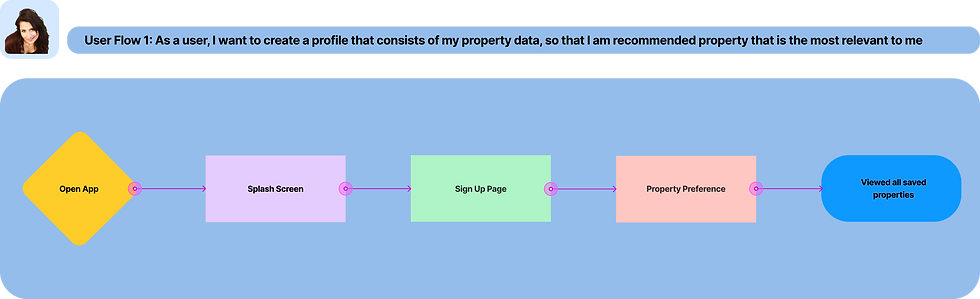
User Flow
In order to determine the perspective of the user, I developed a user flow that identifies and distinguishes the various paths and decisions that the users will have to follow in order to complete a specific task. As a result, this allowed me to determine which screens will be required to assist the user in successfully completing the task


Wireframes
Low-Fidelity
Once I was able to construct the navigation of the app, I began sketching low-fidelity wireframes to determine how the structure of the app will operate as well as meet the needs and wants of the users
Sketches
Task #1: Create a profile containing property data

Splashscreen

Search Properties

Login Screen

Listing Screen

Create Account

Listing Description
Feel free to preview the entire low-fidelity prototype
Mid-Fidelity
Next, I ensured to develop mid-fidelity wireframes. I included UI elements to serve as an aid when conveying the functionality of the app
Task #1: Create a profile containing property data

Splash Screen

Search Properties

Login Screen

Listing Screen

Create Account

Listing Description
Feel free to preview the entire mid-fidelity prototype
Visual Direction
Mood Board
In order to identify and distinguish the style of the app, I designed a mood board to set the tone and develop ideas that will determine the overall visual navigation of the app. The main goal is introduce a minimalist aesthetic for the purpose of generating a clean and simplified look
![Moodboard.[a].png](https://static.wixstatic.com/media/ccd845_7319ccf125194f03b1554b93b1179030~mv2.png/v1/fill/w_979,h_659,al_c,q_90,usm_0.66_1.00_0.01,enc_avif,quality_auto/Moodboard_%5Ba%5D.png)
Feel free to preview the mood board
Style Guide
After the completion of the mood board, I proceeded onto the next phase of the project and started working on a style guide. The style guide consisted of color palettes, typography, UI elements, as well as appropriate and inappropriate imagery


Responsive Design
Incorporating the mobile-first approach, the wireframes acknowledged breakpoints to satisfy the dimensions found in various screens that accompanied individual devices. The sample screen for the mobile device exhibited the 375px breakpoint whereas the sample screen for the tablet exhibited the 768px. In addition, the sample screen for the desktop included the breakpoint of 992px. However, in order to display a more detailed resolution for the users utilizing the desktop, the margin was increased to 164px from 20px. Ultimately, the breakpoint of 1280px was the final decision for the desktop. Examples of the application pertaining to the layout grids can be found below

Final Protoype
A completed and final prototype was developed with high-fidelity wireframes as well as screens
Conclusion
In retrospect, I learned that UI is equally as important as UX. Each color, spacing, UI Element, visual hierarchy, and typeface is instrumental in developing an effective user experience while having a strong impact on the look and feel of the app.
Task #1: Create a profile containing property data

Splash Screen
![User Flow 1_ Search.And.Filter.Properties.[High.Fidelity].png](https://static.wixstatic.com/media/ccd845_eaa50ef3e1364a91baec017ca06995ac~mv2.png/v1/fill/w_120,h_247,al_c,q_85,usm_0.66_1.00_0.01,enc_avif,quality_auto/User%20Flow%201_%20Search_And_Filter_Properties_%5BHigh_Fidelity%5D.png)
Search Properties
![Login.Screen.[High.Fidelity].png](https://static.wixstatic.com/media/ccd845_945d48b7aec44496b120674e095df10c~mv2.png/v1/fill/w_120,h_247,al_c,q_85,usm_0.66_1.00_0.01,enc_avif,quality_auto/Login_Screen_%5BHigh_Fidelity%5D.png)
Login Screen
![User Flow 1_ Listing.Screen.[High.Fidelity].[1].png](https://static.wixstatic.com/media/ccd845_2a50218fa7d647c0bbf870eb95afbc4a~mv2.png/v1/fill/w_121,h_247,al_c,q_85,usm_0.66_1.00_0.01,enc_avif,quality_auto/User%20Flow%201_%20Listing_Screen_%5BHigh_Fidelity%5D_%5B1%5D.png)
Listing Screen
![Create.Account.[High.Fidelity]-4.png](https://static.wixstatic.com/media/ccd845_7895a6c79f98453fac0cddaa91df219e~mv2.png/v1/fill/w_115,h_236,al_c,q_85,usm_0.66_1.00_0.01,enc_avif,quality_auto/Create_Account_%5BHigh_Fidelity%5D-4.png)
Create Account
![User Flow 1_ Listing.Description.[High.Fidelity].[2].png](https://static.wixstatic.com/media/ccd845_104c411971be42d0ba5f909a68984c53~mv2.png/v1/fill/w_121,h_247,al_c,q_85,usm_0.66_1.00_0.01,enc_avif,quality_auto/User%20Flow%201_%20Listing_Description_%5BHigh_Fidelity%5D_%5B2%5D.png)
Listing Description
bottom of page